Project Brief
Redesigning the SAAS plaftform
In aligning the Saas platform's user interface with our corporate identity, I introduced a color scheme complementary to our company logo, conceptualized a sleek retractable menu for enhanced user navigation, and reimagined button designs alongside subtle microinteractions to enrich user engagement.
Problem
Defining the problem
We realized companies investing in Growsure will need clear instructions on how to sign up, and independently use the platform to maximize efficiency in which Growsure captures vital business information to commence the consultation process.
By comparing with the competitors, we found the existing design has the following issues
The menu was found cluttered.
Inadequate message feedback to the user.
No progress indicator.
Consistency was lost.
No option to select which part of PDF report to be generated.
The theme of the platform made it does not look like from the company.
User Flow
Designing the new user flow
When designing the new user flow. I used the MVP Quadrant to help. The following points were considered.
Implemented the tour to the new user.
Redesigned the menu with better navigations.
Redesigned the layout and buttons according their functionality.
Applied a new colour theme to match with the company’s logo.
The MVP Quadrant
The new user flow
UI Design
UI Design - Welcome Tour
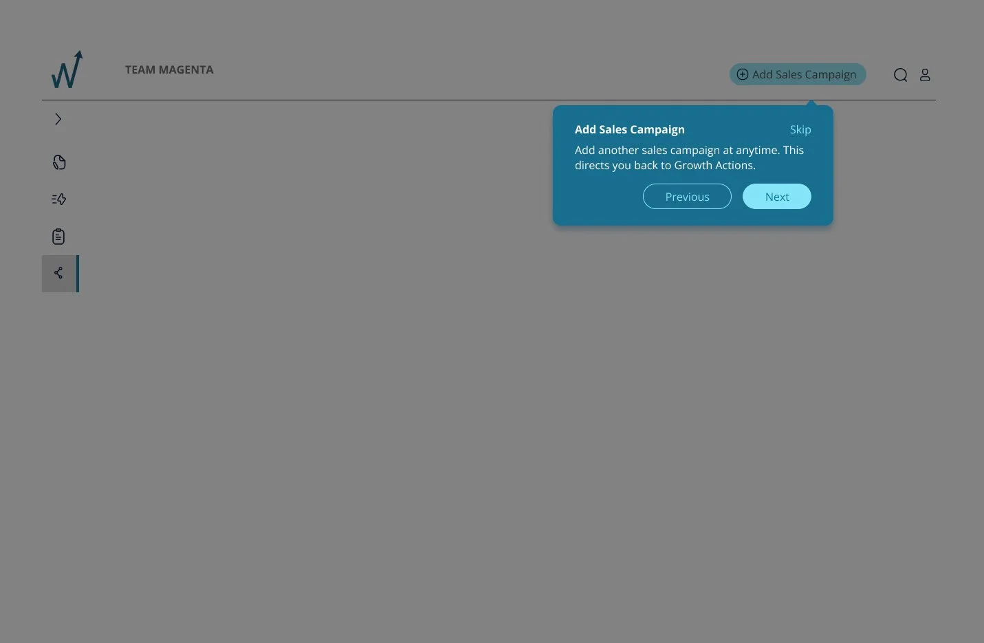
Designing an introductory tour for new users to enhance their understanding of the platform. This tour aims to guide users through the process of creating an account manager and initiating a sales campaign. It will feature step-by-step instructions and interactive elements to ensure users are comfortable with the platform's functionalities, helping them to effectively manage their accounts and launch successful sales campaigns with ease.
Account Manager Setup Tour
Sales Campaign Tour
UI Design - New Menu
Redesigning the platform's menu to improve its hierarchical structure. This involves reorganizing menu items for intuitive navigation, grouping related functions for easier access, and implementing a clean, streamlined design for better visibility. The new menu design focuses on user experience, ensuring that users can find the most important features quickly while also exploring the full range of functionalities offered by the platform more efficiently.
Main menu in retracted and expanded forms
UI Design - Prototype
Following the implementation of the new features, a prototype of the platform has been established. This prototype serves as an initial model to demonstrate the functionality and design of the recent updates. It provides a tangible representation for testing and evaluation, allowing for the identification and refinement of any areas that require further improvement or adjustment before the final rollout.
The new SAAS platform with improved navigation and colours.
UI Design - Report generation
Users now have the enhanced capability to choose specific reports they wish to generate from a diverse selection within the platform. Once a report is selected, they can preview it in real-time. This preview feature allows users to see preview of the report, offering insights into the data and format before outputing to PDF. This functionality ensures that users can select the contents, ensuring the report meets their specific requirements and preferences.
Generating and previewing reports
UI Design - Learning Centre
Users have access to a comprehensive suite of resources designed to enhance their proficiency in using the platform. This includes detailed tutorials, step-by-step guides, and FAQs, covering a wide range of topics from basic navigation to advanced features. Additionally, interactive webinars and video demonstrations are available, offering users practical insights and tips for optimizing their use of the platform. These resources are continually updated to reflect the latest features and best practices.
The poped up learning center
Outcomes
Peer Review & Further Steps
Change the language of the platform to something users of the platform will understand and are easy to digest ie: ‘Growth Action’ - what does that mean in simple terms?
Simplify onboarding and make it fun. Make signing up ‘fun’ and ‘exciting’ and ‘they are stoked to be there on Growsure’ at first sign up.
How can users stay engaged with data entry, which at the end just produces a PDF.
We have obtained valuable comments from the peer review. The following steps would be our approach.
Address the points raised from Design Review
User testing
Feedback to improve the learning portal
Continue to iterate and test terminology like “Pitch”
Build out to high fidelity prototype, incorporate the solutions from other teams and carry out user testing on the entire app.


